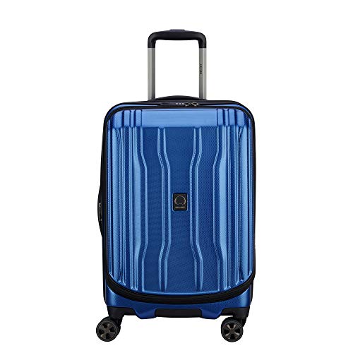
What Is A Travel Brochure, Really?

What is a travel brochure usually sounds like a simple question, but the answer carries more weight than a folded piece of glossy paper. A travel brochure is a compact travel guide built to spark interest, explain a destination, and help someone picture the trip before any bags are packed. It blends practical details with a little daydream fuel, which is why a strong brochure doesn’t just name places, it makes them feel reachable. Done well, it turns scattered curiosity into a clearer sense of where to go, what to expect, and why the trip might be worth the trouble.
A good brochure works because travel planning can get messy fast. One minute, the beach looks tempting, then the museum district pops up, then food, transport, weather, costs, and timing all start elbowing their way into the picture. That’s where a travel brochure earns its keep by gathering the essentials in one neat, readable place. Instead of dumping every possible fact onto the page, it trims the noise and gives the reader enough direction to keep moving.
The best brochures balance visual appeal with real usefulness. Photos set the mood, sure, but captions, maps, short descriptions, suggested activities, and contact details give the piece its backbone. A pretty brochure with thin information feels like window dressing, while a plain one with clear guidance can still help, though it may not pull the eye as quickly. The sweet spot sits between charm and clarity, where the design nudges interest and the words answer the questions already forming in someone’s head.
What is a travel brochure also depends on how it’s used. Some brochures promote a city, resort, cruise, tour package, national park, hotel, museum route, or local attraction. Others act more like quick-reference guides, pointing out safety tips, seasonal highlights, cultural notes, opening hours, or nearby services. Either way, the brochure has one job at heart: make the next step feel less fuzzy.
There’s a little art in writing one, too. Overstuff it, and the page starts to feel like a suitcase that won’t zip. Make it too vague, and it floats away without helping anyone decide a thing. Strong brochure copy uses specific benefits, plain language, and sensory detail, so a reader can imagine the walk through an old market, the quiet of a lakeside trail, or the ease of getting from the station to the hotel.
Digital brochures have stretched the format, but the basic idea hasn’t wandered far. A downloadable PDF, a web-based destination guide, and a printed tri-fold can all do the same core work if they organize travel information cleanly. The format matters less than the promise: clear travel information, a reason to care, and enough detail to make planning feel lighter. That’s the real value tucked inside a travel brochure, whether it sits on a hotel counter or opens on a phone screen.

- TLR Rank9.2
TLR Rank is a ranking system developed by TravelLuggageReviews.com. TLR Rank has no relationship or impact from any manufacturers or sales agent websites. Learn more
- BrandZVMIS

- TLR Rank9.0
TLR Rank is a ranking system developed by TravelLuggageReviews.com. TLR Rank has no relationship or impact from any manufacturers or sales agent websites. Learn more
- BrandGoShambar

- TLR Rank8.6
TLR Rank is a ranking system developed by TravelLuggageReviews.com. TLR Rank has no relationship or impact from any manufacturers or sales agent websites. Learn more
- BrandPruQuaiy
Last update on 2026-09-10 / Affiliate links / Images, Product Titles, and Product Highlights from Amazon Product Advertising API
What Is A Travel Brochure
Travel plans can get messy before the fun even begins. A place looks exciting, then the questions start crowding in: where to stay, what to see, how far things are, what fits the budget, and what feels worth the trip. That’s where what is a travel brochure becomes more than a basic definition, because a good brochure turns scattered travel interest into clear destination guidance. It gives a place shape, mood, and practical direction without making someone dig through a dozen tabs.
What Is A Travel Brochure
What is a travel brochure can be answered simply: it’s a printed or digital piece of travel content that presents a destination, attraction, hotel, tour, or travel service in a clear and appealing way. The better answer, though, is a little more useful. A travel brochure works like a small planning shortcut, giving readers the highlights, essential details, and emotional spark they need to picture a trip. It should help someone move from “That sounds nice” to “Okay, this could actually work.”
A brochure usually includes destination descriptions, images, maps, activity ideas, pricing notes, contact details, travel tips, or suggested routes. The format can be a folded leaflet on a visitor center rack, a hotel handout, a downloadable PDF, or a web-based guide. The medium changes, but the job stays the same: make travel choices feel less cloudy. A brochure that only looks pretty but skips useful details feels thin, while a brochure packed with facts but no personality can feel like homework.
The real strength of a travel brochure sits in its balance. It has to be short enough to scan, but rich enough to answer the questions that pop up fast. People don’t want a textbook on a beach town, a historic district, or a weekend tour. They want the main reasons to care, the practical bits that prevent hassle, and the kind of visual cues that make the place feel real.
Think of a brochure as a conversation starter, not the whole trip plan. A strong one might say, “Walk the old harbor at sunset, grab dinner near the pier, then take the morning ferry before the crowds roll in.” That kind of line does more than name a place. It creates a simple travel scene, and that scene helps readers imagine themselves there without feeling pushed or oversold.
Why Travel Brochures Still Matter
Plenty of travel research happens online, but travel brochures still matter because they organize choices in a calmer way. Search results can feel like a noisy street market, with ads, reviews, maps, videos, and booking pages all yelling at once. A brochure narrows the field and says, “Start here.” That small bit of order can be a relief, especially for a trip with too many moving parts.
A good brochure also respects the way people actually plan. Some readers skim for quick highlights, some study maps, and some jump straight to prices, opening hours, or transportation notes. The brochure needs to serve all of them without turning into a cluttered mess. Short sections, clear labels, and practical language help the page feel friendly instead of fussy.
For local tourism boards, tour operators, hotels, museums, and attractions, the brochure becomes a trust-building tool. It signals that the experience has been thought through. Clear directions, honest limitations, seasonal notes, and realistic activity descriptions all reduce guesswork. Nobody wants to arrive at a “quiet scenic trail” and find out it’s a steep climb with no shade, no water access, and no nearby parking.
Brochures also work because they can travel with the reader. A printed piece gets tucked into a bag, shared across a table, or marked with a pen. A digital brochure gets saved, forwarded, or opened again at the airport gate. To keep carry-on planning tidy, pair brochure notes with best executive backpack options that protect documents, tablets, and travel basics without turning every stop into a rummaging session.
What A Strong Travel Brochure Includes
A strong brochure starts with a clear promise. It should tell readers what kind of travel experience they’re looking at, whether that means quiet nature, food-heavy wandering, family-friendly activities, luxury downtime, budget exploring, or a packed cultural route. Without that promise, the brochure feels like a pile of nice facts. With it, every photo, paragraph, and detail starts pulling in the same direction.
The next piece is useful destination detail. Readers need to know what makes the place worth their time, but they also need practical help. That can include best seasons, average visit length, nearby transit, walking difficulty, booking notes, local etiquette, weather concerns, and what to bring. A brochure that says “beautiful mountain views” is fine, but “bring a light layer because the overlook gets windy by late afternoon” feels much more grounded.
Visuals do a lot of heavy lifting, but they can’t carry the whole brochure alone. Photos should support the message, not decorate empty space. A bright food market photo pairs well with a short note about morning hours, local snacks, and the busiest entry point. That mix gives the reader sensory appeal and practical confidence at the same time.
Maps, small route notes, and packing reminders can be surprisingly helpful. A museum district brochure might show a walking loop, while a coastal guide might mark restrooms, shuttle stops, and shaded picnic spots. Readers often carry printed guides, notebooks, or travel books with them, so use how to pack books in a suitcase tips to keep reference materials from bending, sliding, or eating up space. Small choices like that make the trip feel smoother before the first step.
How Brochures Solve Real Travel Friction
Most travel frustration starts with uncertainty. People wonder whether a place is worth the drive, whether the photos are honest, whether the route is easy, or whether the experience fits the pace they want. A useful travel brochure lowers that tension by turning vague interest into a short list of knowable details. It doesn’t need to answer every possible question, but it should answer the first ones well.
Good brochure copy speaks to those quiet doubts without naming them too loudly. Instead of saying, “Don’t worry about being confused,” it can explain where to park, how long the main walk takes, and which entrance is easiest to find. Instead of promising a flawless day, it can give realistic expectations about crowds, weather, terrain, or booking limits. That kind of honesty builds more confidence than shiny adjectives ever could.
A brochure can also prevent mismatch. A romantic wine trail, a busy theme park day, a rugged canyon hike, and a slow historic village walk are very different trips. Clear descriptions help readers avoid picking the wrong kind of experience for their energy, schedule, or comfort level. Strong brochures don’t try to make every place sound right for every person, because specific travel fit beats broad hype every time.
Road texture, walking distance, and luggage drag matter more than many travel pages admit. A brochure for an old European town, a historic village, or a hilltop district should make terrain feel clear, not hidden in fine print. To make rough streets less of a hassle, compare best luggage for cobblestone streets choices before rolling a stiff suitcase through uneven stone lanes. That simple detail can save a traveler from sore wrists, broken wheels, and a grumpy first afternoon.
Writing Style That Makes A Brochure Work
Brochure writing needs to be tight, but not lifeless. The best lines feel like someone helpful is pointing out what matters, not like a robot stacking adjectives. Travel brochure copy should use concrete nouns, active verbs, and details that create a small scene. “Follow the shaded riverside path to three cafés and a weekend craft market” beats “Enjoy a memorable local experience” by a country mile.
Strong wording also avoids overselling. Readers can smell forced excitement pretty quickly, especially after seeing the same travel phrases everywhere. A brochure shouldn’t call every view breathtaking or every stop hidden. Better copy says what the place actually offers, where it shines, and where it may not fit, which makes the whole piece feel more believable.
Specificity helps the brochure earn attention. Instead of “great restaurants nearby,” write about seafood stalls near the pier, bakeries beside the morning market, or late-night noodle shops close to the station. Instead of “fun activities,” point to kayak rentals, guided walking tours, family bike paths, or rainy-day galleries. These details create decision-friendly travel content because they connect the promise of a destination to the small choices that shape a real trip.
Still, the brochure can’t become a wall of text. Short paragraphs, clean section breaks, and purposeful bolding keep the page easy to scan. A reader might only give the brochure a minute before deciding whether to keep it, save it, or toss it aside. Every sentence should earn its spot by adding clarity, confidence, or a sharper sense of place.
Design Details That Support The Message
Design is not just decoration in a travel brochure. It controls what the reader notices first, what they trust, and what they remember after the page is closed. A crowded layout can make even a beautiful destination feel stressful. A clean layout gives the eyes room to move, which makes the information easier to absorb.
Photos should match the actual travel promise. A brochure for a quiet retreat shouldn’t lean on crowded nightlife shots unless nightlife is part of the deal. A family nature park brochure should show paths, picnic areas, rest spots, or hands-on activities, not only sweeping landscape images. The right images help set accurate expectations, and accurate expectations reduce disappointment.
Typography matters, too, though readers may not notice it directly. Clear font sizes, strong contrast, and simple spacing make the brochure easier to scan in real travel situations, like standing near a hotel desk or sitting in a rental car. Tiny text may look elegant on a screen, but it gets annoying fast in bright sun or low lobby light. Practical design keeps readability ahead of fancy tricks.
The best brochures use layout to guide decisions. A strong cover pulls interest, the inside panels explain highlights, and the final panel gives contact details, booking steps, address notes, or a simple map. That flow feels natural because it mirrors how people think: first the dream, then the details, then the next step. A brochure that supports that rhythm can make travel planning feel less like a chore and more like a plan finally clicking into place.
How A Travel Brochure Helps Plan Smarter Trips
A brochure earns attention when it makes the next decision feel easier. After the first half of the article explained what is a travel brochure and why the format still matters, the next step is seeing how it handles the real pressure points of planning. People don’t just need pretty place names; they need clear travel signals, honest details, and a smoother path from interest to action. A strong brochure works like a calm voice in a crowded room, pointing out what matters without making the trip feel overplanned.
Turning Curiosity Into A Clear Travel Path
A reader often starts with a loose idea, not a finished plan. Maybe the destination sounds charming, or a friend mentioned it over coffee, or a photo made the place stick in their head. A good travel brochure takes that fuzzy spark and gives it structure. It shows what the place offers, what the visit might feel like, and which details deserve attention first.
The smartest brochures don’t throw every attraction onto the page. They shape the trip around simple decision points, like best visit length, nearby stops, transport options, and the kind of experience the place actually delivers. That saves readers from the annoying back-and-forth of opening maps, reviews, booking pages, and random blog posts all at once. Less noise, more direction.
A clear brochure also helps with emotional friction. Travel sounds fun until the tiny worries start buzzing around: Is this worth the drive? Will the area be easy to navigate? Does the experience match the photos? By answering those questions with plain, specific details, the brochure makes the trip feel less like a gamble.
That same clarity matters for work travel, too. A conference visitor may scan a brochure between meetings and need quick notes on transit, dining areas, or nearby landmarks. For polished day-to-day carry, keep printed guides, folders, and devices organized with a best leather briefcase for lawyers style that fits professional trips without making travel documents look like an afterthought.
Making Practical Details Feel Less Overwhelming
Useful travel content has to respect short attention spans. Nobody wants to wrestle with a dense wall of copy while standing in a hotel lobby or scrolling on a phone with low battery. A strong brochure layout breaks information into small, useful chunks. It gives readers enough detail to feel oriented without dragging them through every possible scenario.
Practical details carry more weight than fancy adjectives. Opening hours, ticket notes, weather quirks, restroom locations, walking distance, shuttle stops, and booking instructions can quietly shape the whole trip. Those details may not sound glamorous, but they prevent the kind of small travel headaches that sour a day fast. Clarity beats hype every single time.
The brochure should also make limitations visible without killing interest. A rocky trail, a seasonal ferry, a cash-only market, or a museum with timed entry can still be worth visiting. The problem starts when those details are buried or missing. Honest notes create realistic expectations, and realistic expectations make the experience feel smoother once the trip begins.
Luggage context belongs in practical planning more often than people admit. A long brochure for a multi-city route might mention transit changes, stair-heavy stations, or weather swings between stops. For longer itineraries where packing space matters, compare best lightweight softside checked luggage options that leave room for brochures, layers, souvenirs, and the little extras that always sneak into the bag.
%product_cta:5%
Using Visuals Without Letting Them Do All The Work
Photos pull readers in first, but they shouldn’t carry the whole message alone. A glossy beach photo may create interest, yet it doesn’t explain parking, water conditions, nearby food, or the best time to arrive. A well-made travel brochure pairs images with captions and short descriptions that add useful context. That pairing helps readers picture the place and plan around it.
Strong visuals should match the actual experience. A quiet garden brochure should not rely on crowded festival shots unless those events are central to the visit. A historic town brochure should show streets, landmarks, walking areas, and local texture rather than only dramatic skyline images. Accurate visuals build trust because they reduce the gap between expectation and arrival.
Captions deserve more respect than they usually get. A caption can explain where a viewpoint is, how long a walk takes, or why a seasonal event matters. That tiny bit of writing can turn a pretty image into useful travel guidance. Without it, the photo may look nice but leave readers guessing.
Good design also knows when to breathe. White space, readable type, and clear sections help readers slow down and absorb the message. A brochure packed edge to edge with photos, icons, offers, and slogans can feel like a messy bulletin board. The best design makes the page feel easy, not empty.
Building Trust Through Honest Travel Copy
Trust grows when the brochure sounds specific. “Enjoy local food” feels thin, but “Try grilled seafood along the harbor before the evening boat traffic picks up” gives the reader something to hold onto. Specific travel copy feels more useful because it points to a real moment. It helps the reader imagine the day without forcing a sales pitch.
Honest copy also avoids pretending every destination fits every mood. Some trips are better for slow wandering, while others reward tight planning and early starts. A brochure should help readers sense that difference. Travel fit matters because a good trip is not only about the place; it’s about matching the place to the pace, budget, and comfort level of the visit.
A brochure can still sound inviting without exaggeration. It can say a trail has steep sections, a market gets crowded after lunch, or a scenic road has limited fuel stops. Those details don’t scare people away if the experience is worth it. They make the brochure feel grounded, and grounded writing usually earns more trust than loud praise.
Quotes can help, but they should feel real and restrained. A short line from a local guide, ranger, curator, or business owner can add warmth without turning the page into a testimonial parade. Even a simple quote like “The morning light is the best reason to start early” can make a route feel more human. Used carefully, local perspective gives the brochure texture.
Helping Readers Act Without Feeling Pushed
A brochure should guide action, not shove it. Readers may need a booking link, phone number, address, QR code, map marker, or suggested next stop, but the wording should feel helpful. Clear calls to action work best when they solve a problem already raised by the page. That keeps the next step natural instead of needy.
The call to action should match the travel moment. A museum brochure may suggest reserving timed tickets before a weekend visit. A hiking guide may point readers toward weather updates and trail status. A hotel area brochure may nudge readers to save a walking map before leaving Wi-Fi. Each action supports better trip flow rather than sounding like a sales command.
Placement matters, too. A call to action near route details can help with navigation, while one near pricing can help with booking. Dropping a random link into an unrelated paragraph feels clumsy and breaks trust. The best brochure makes action feel like the next obvious step, not a loud interruption.
Readers also appreciate small reminders that lower stress. A note about carrying water, booking ahead, packing layers, or allowing extra walking time can prevent friction later. These little details are not flashy, but they make a brochure more useful in the real world. Helpful travel planning often lives in the small stuff.
Keeping The Brochure Useful After The First Read
A brochure should still help after the first scan. People may save it, fold it, mark it, send it to a friend, or reopen it while standing on a street corner. That means the structure has to be easy to revisit. Readable sections, clear labels, and practical details make the brochure useful beyond the first impression.
Digital brochures need the same discipline as printed ones. A PDF with tiny text, oversized photos, and buried contact details can frustrate readers just as quickly as a cluttered paper foldout. Mobile-friendly spacing, clickable navigation, and clean headings make digital formats easier to use. Good brochure design respects the moment someone actually needs the information.
Printed brochures still have their own charm. They can sit on a counter, slip into a pocket, or become a quick reference during a walk. But print has less room for error because every inch matters. A strong printed brochure uses tight copy, purposeful images, and only the details that truly help.
The lasting value of what is a travel brochure comes down to usefulness. It’s not just a promotional sheet or a pretty travel teaser. It’s a compact guide that helps turn interest into movement, movement into a plan, and a plan into a trip that feels less confusing before it even begins.


9 Best Travel Camping Table of 2026 For Uneven Ground
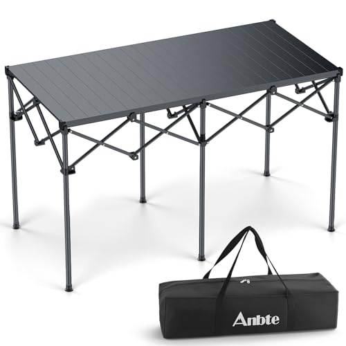
12 Best Heavy Duty Camping Table of 2026 That Will Not Wobble or Sag
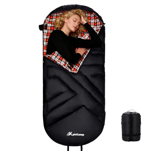
10 Best Sleeping Bags For Tall People of 2026 To Stretch Out Fully
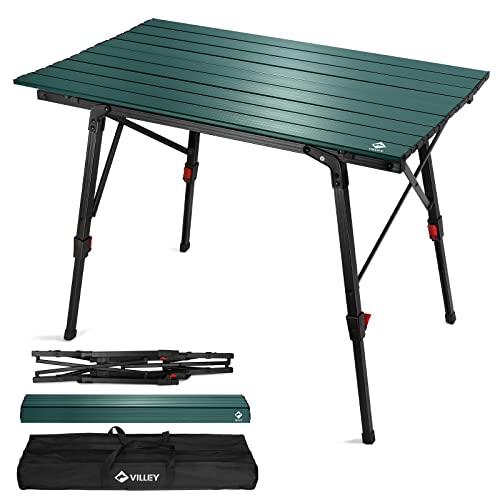
8 Best Camping Table Adjustable Legs of 2026 for Uneven Ground

10 Best Diaper Bag Backpacks For Dads of 2026 With Fast Gear Access

11 Best Framed Luggage of 2026 For Zipperless Security

11 Best Folding Two Wheeler For Luggage of 2026 To Prevent Tipping

11 Best Expandable Roller Luggage of 2026 That Fit Overhead Bins